CHPT18 - Model Basics with modelr
(1)随机参数拟合
本章介绍线性模型的拟合,首先使用最简单粗暴的方法:随机参数拟合,来理解模型的本质。以下为探索过程。
1
2
3
4
5
6
7
8
9
10
11
12
13
14
15
16
17
18
19
20
21
22
23
24
25
26
27
28
29
30
31
32
33
34
35
36
37
38
39
40
41
42
43
44
45
46
47
library(tidyverse)
library(modelr)
# 系统自带的模拟数据
=======================
> sim1
# A tibble: 30 x 2
x y
<int> <dbl>
1 1 4.20
2 1 7.51
3 1 2.13
4 2 8.99
5 2 10.2
# ... with 26 more rows
=======================
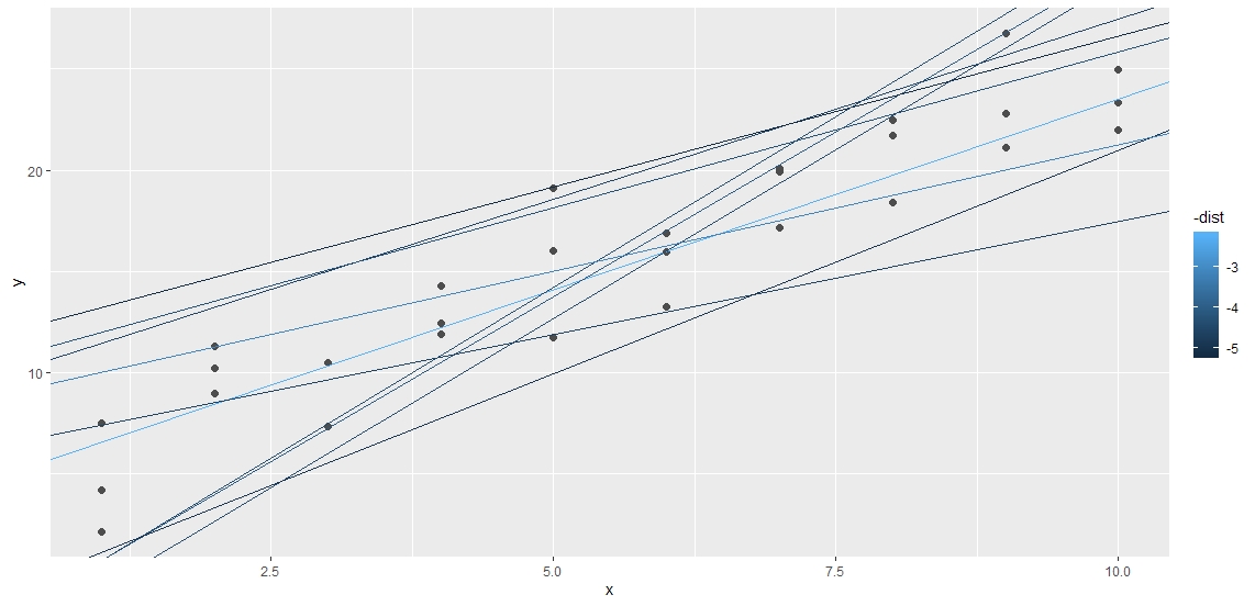
# 定义随机参数(250 组截距和斜率)
rand_coef <- tibble(
itc = runif(250, -20, 40),
slp = runif(250, -5, 5)
)
ggplot(sim1, aes(x, y)) + geom_abline(aes(intercept=itc, slope=slp),
data=rand_coef,
alpha=1/4) + geom_point()
# 衡量模型误差(最小二乘法)
measure_distance <- function(itc, slp, data){
diff <- data$y - itc - data$x * slp
sqrt(mean(diff^2))
}
# 计算每组系数的误差
distances <- 1:250
for (i in seq_along(distances)){
distances[i] <- measure_distance(rand_coef[['itc']][i],
rand_coef[['slp']][i],
sim1)
}
rand_coef_dist <- rand_coef %>% mutate(dist=distances)
# 取误差最小的前十组
ggplot(sim1, aes(x,y)) +
geom_point(size=2, color="grey30") +
geom_abline(aes(intercept=itc, slope=slp, color=-dist),
data=filter(rand_coef_dist, rank(dist) <= 10)
)
(2)系统拟合方法
1
2
3
4
5
6
7
8
9
10
11
12
13
14
15
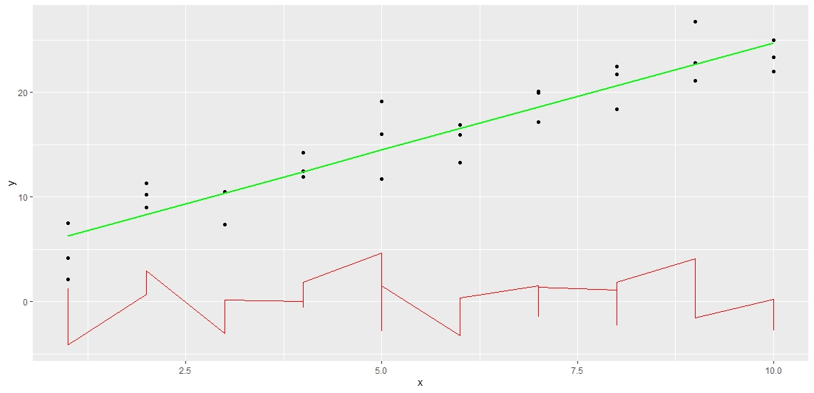
# 使用 lm 函数一步完成最小二乘线性拟合
sim1_mod <- lm(y~x, data=sim1)
==========================
> coef(sim1_mod)
(Intercept) x
4.220822 2.051533
==========================
# 计算模型残差和预测值
sim1 <- sim1 %>% add_residuals(sim1_mod) %>% add_predictions(sim1_mod)
# 可视化拟合结果
ggplot(sim1, aes(x)) +
geom_point(aes(y=y)) +
geom_line(aes(y=pred), color="green", size=1) +
geom_line(aes(y=resid), color="red")
(3)其他模型拟合
lm(y~x1+x2, data)lm(y~x1*x2, data)lm(y~ns(x, n), data)model_matrix(data, y~x^2+x)model_matrix(data, y~I(x^2)+x)model_matrxi(data, y~poly(x, 2))
(4)其他模拟拟合函数
- 广义线性模型:
stats::glm() - 广义可加模型:
stats::gam() - 惩罚线性模型:
glmnet::glmnet() - 鲁棒线性模型:
MASS::rlm() - 决策树模型:
rpart::rpart()
CHPT19 - Model Building
上一章通过模拟数据了解模型拟合函数,本章使用实际数据进行应用。迭代以下分析流程:
- 发现问题
- 问题假设
- 模型选择
- 残差分析
- 新问题
1
2
3
4
5
library(modelr)
library(tidyverse)
library(lubridate)
library(nycflights13)
options(na.action = na.warn)
(1)钻石价格与品质的关系
1
2
3
4
5
6
7
8
9
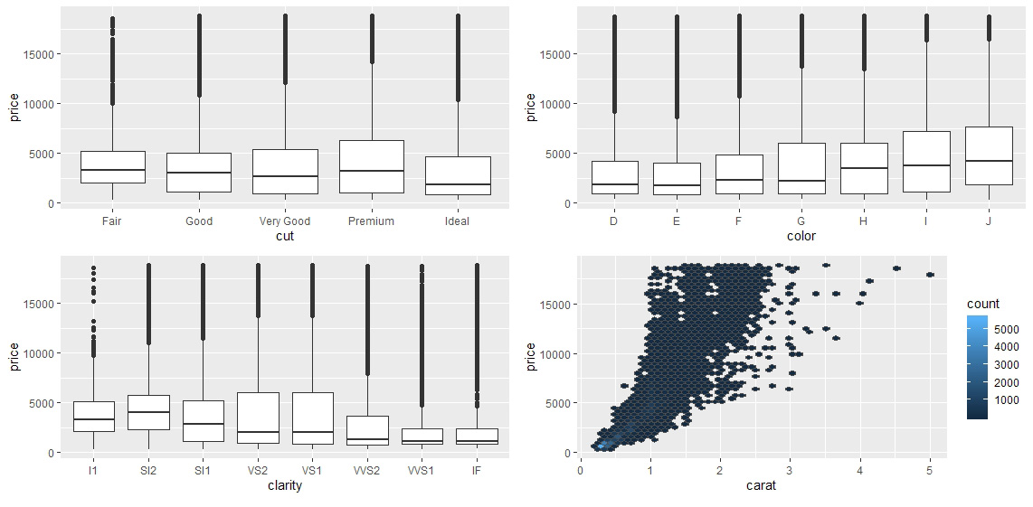
# 首先进行可视化分析,查看每个品质变量与价格的相关关系
ggplot(diamonds, aes(cut, price)) + geom_boxplot()
ggplot(diamonds, aes(color, price)) + geom_boxplot()
ggplot(diamonds, aes(clarity, price)) + geom_boxplot()
# 可以看到在前三个变量中,品质最高的分组都不是均价最高的
# 原因可能是由于低品质的钻石往往重量更大
# 因此需要对重量与价格的关系进行建模分析
ggplot(diamonds, aes(carat, price)) + geom_hex(bins=50, color="grey30")
1
2
3
4
5
6
7
8
9
10
11
12
13
14
15
16
17
18
19
20
21
22
23
24
25
26
27
28
29
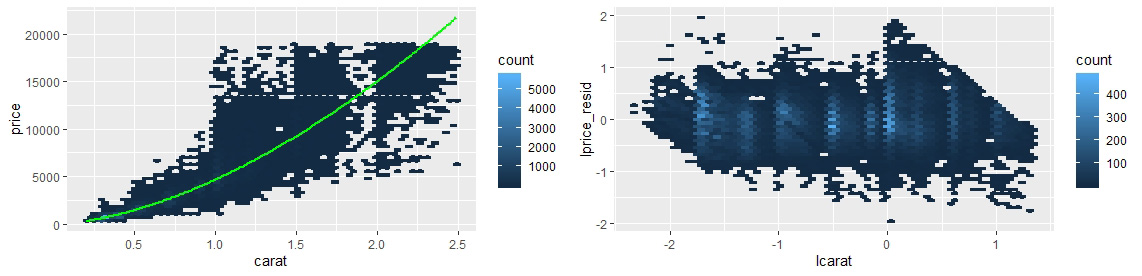
# 观察 carat 与 price 的相关趋势,接近指数关系,因此转为对数坐标系
diamonds <- diamonds %>% filter(carat < 2.5) %>%
mutate(lprice=log2(price), lcarat=log2(carat))
# 在进行可视化,发现对数化之后呈现线性关系
# 进行线性回归
mod <- lm(lprice~lcarat, data=diamonds)
# 添加预测值和残差
diamonds <- diamonds %>%
add_predictions(mod, 'lprice_pred') %>% mutate(price_pred=2^lprice_pred) %>%
add_residuals(mod, 'lprice_resid')
===============================================================================
> diamonds[c('carat', 'price', 'lprice', 'lcarat', 'lprice_pred', 'price_pred', 'lprice_resid')] %>% head(5)
# A tibble: 5 x 7
carat price lprice lcarat lprice_pred price_pred lprice_resid
<dbl> <int> <dbl> <dbl> <dbl> <dbl> <dbl>
1 0.23 326 8.35 -2.12 8.63 396. -0.279
2 0.21 326 8.35 -2.25 8.41 340. -0.0587
3 0.23 327 8.35 -2.12 8.63 396. -0.275
4 0.290 334 8.38 -1.79 9.19 584. -0.807
5 0.31 335 8.39 -1.69 9.35 654. -0.964
===============================================================================
# 可视化模型结果
ggplot(diamonds, aes(carat, price)) + geom_hex(bins=50) +
geom_line(aes(carat, price_pred), color="green", size=1)
# 残差值的分布
ggplot(diamonds, aes(lcarat, lprice_resid)) + geom_hex(bins=50)
1
2
3
4
5
6
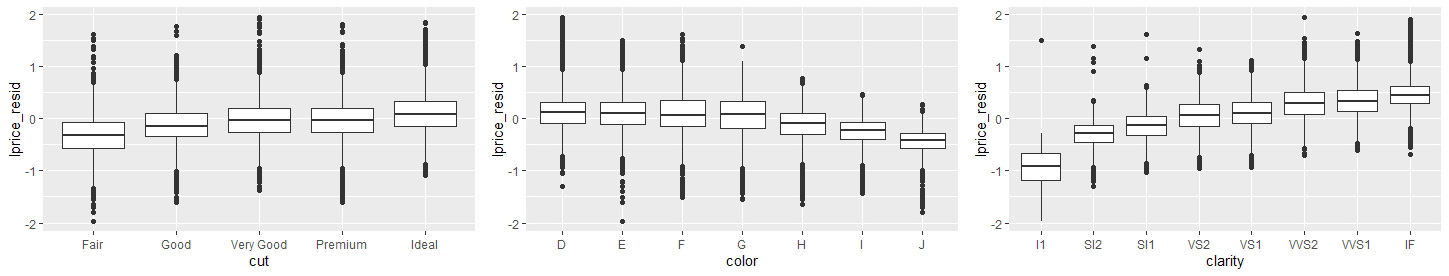
# 残差中去除了重量与价格的相关性,接下来查看品质变量与价格的关系
ggplot(diamonds, aes(cut, lprice_resid)) + geom_boxplot()
ggplot(diamonds, aes(color, lprice_resid)) + geom_boxplot()
ggplot(diamonds, aes(clarity, lprice_resid)) + geom_boxplot()
# 可以看到在残差中,品质因子与价格变量表现出合理的相关性
1
2
3
4
# 直接使用多变量模型进行拟合
mul_mod <- lm(lprice~lcarat+color+cut+clarity, data=diamonds)
diamonds %>% add_predictions(mul_mod)
# 分析略
(2)影响航班每日数量的因素
1
2
3
4
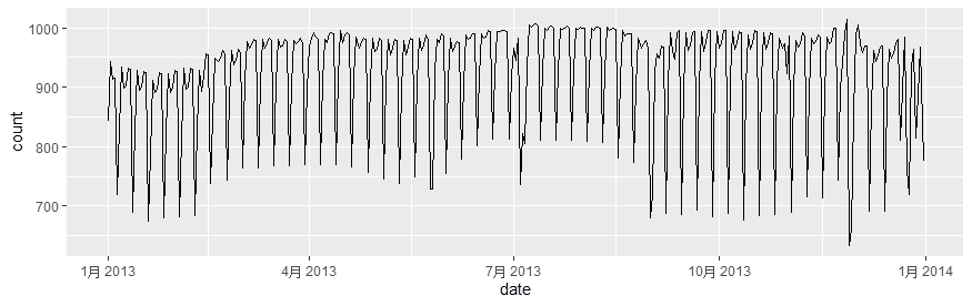
# 计算每日航班数量的分布
daily <- flights %>% mutate(date=make_date(year, month, day)) %>%
group_by(date) %>% summarise(count=n())
ggplot(daily, aes(date, count)) + geom_line()
1
2
3
4
5
6
7
8
9
10
11
12
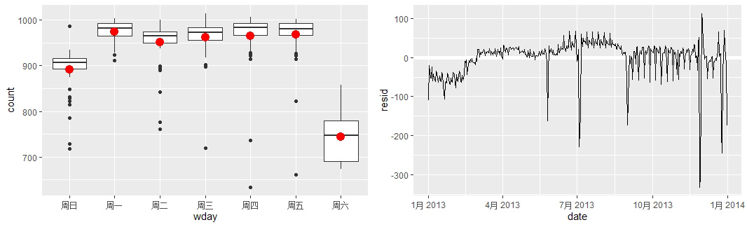
# 可视化呈现了与星期有关的周期性
daily <- daily %>% mutate(wday=wday(date, label = T))
ggplot(daily, aes(wday, count)) + geom_boxplot()
# 可以看到周末的航班最少,建模移除以上相关性
mod <- lm(count~wday, data=daily)
grid <- daily %>% data_grid(wday) %>% add_predictions(mod, "count")
ggplot(daily, aes(wday, count)) + geom_boxplot() +
geom_point(data = grid, size=4, color="red")
# 添加残差
daily <-daily %>% add_residuals(mod)
daily %>% ggplot(aes(date, resid)) + geom_ref_line(h=0) + geom_line()
1
2
3
4
5
6
7
8
9
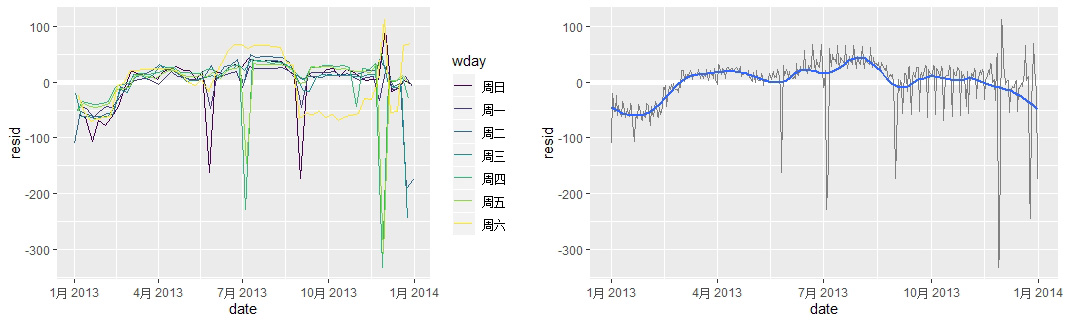
# 可以看到残差里面还遗留了模型没有捕捉到的周期性:
ggplot(daily, aes(date, resid, color=wday)) + geom_ref_line(h=0) + geom_line()
# 按wday分组可以更加清晰地观测到残差里面的模式:
# 例如周六的航班在夏天明显比较多,在秋天比较少
# 某些特定的时间航班会特别多或者特别少,例如某些重要节日
daily %>% filter(resid < -100)
# 图中还存在一个长期的趋势,可以用 geom_smooth 平滑化显示出来
daily %>% ggplot(aes(date, resid)) + geom_ref_line(h=0) +
geom_line(color="grey50") + geom_smooth(se=FALSE, span=0.2)
CHPT20 - More Models with purrr and broom
处理大量数据的三种思路:
- 使用多个简单的模型理解复杂的数据
- 使用列向量在 data.frame 里储存任意的数据结果(nested data.frame)
- 使用 broom 包整理数据
示例:分析 gapminder 数据集
1
2
3
4
5
6
7
8
9
10
11
12
13
14
15
16
library(modelr)
library(tidyverse)
library(gapminder)
# 提出问题:每个国家的 LifeExpectancy 随时间的变化趋势
# 解决思路:参考上一章,通过模型拟合去除线性相关性,最后进行残差分析
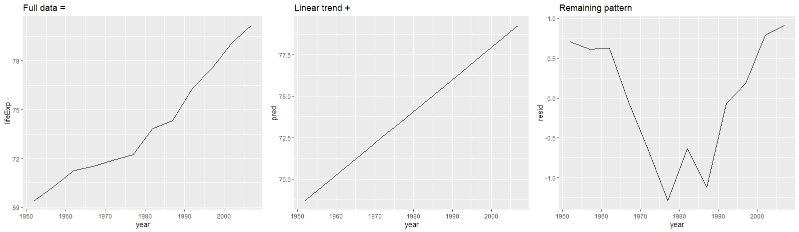
# 取新西兰的数据进行分析
new_zealand <- gapminder %>% filter(country == 'New Zealand')
new_zealand %>% ggplot(aes(year, lifeExp)) + geom_line() + ggtitle("Full data =")
# 建模,得到预测值和残差
mod <- lm(lifeExp~year, data=new_zealand)
new_zealand %<>% add_predictions(mod) %>% add_residuals(mod)
new_zealand %>% ggplot(aes(year, pred)) + geom_line() + ggtitle("Linear trend + ")
new_zealand %>% ggplot(aes(year, resid)) + geom_line() + ggtitle("Remaining pattern")
1
2
3
4
5
6
7
8
9
10
11
12
13
14
15
16
17
18
19
20
21
22
23
24
25
26
27
28
29
30
31
32
33
34
35
36
37
38
39
40
41
42
43
44
45
46
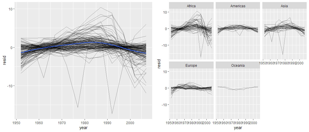
# 将上述过程打包成函数,利用 purrr::map() 对每个国家重复类似的操作
# 首先对不同国家的数据进行分组
group <- gapminder %>% group_by(country, continent) %>% nest()
===========================================
> group %>% head(5) # nest():将组内数据打包
# A tibble: 5 x 3
country continent data
<fct> <fct> <list>
1 Afghanistan Asia <tibble [12 x 4]>
2 Albania Europe <tibble [12 x 4]>
3 Algeria Africa <tibble [12 x 4]>
4 Angola Africa <tibble [12 x 4]>
5 Argentina Americas <tibble [12 x 4]>
>
> group$data[[1]] %>% head(5)
# A tibble: 5 x 4
year lifeExp pop gdpPercap
<int> <dbl> <int> <dbl>
1 1952 28.8 8425333 779.
2 1957 30.3 9240934 821.
3 1962 32.0 10267083 853.
4 1967 34.0 11537966 836.
5 1972 36.1 13079460 740.
===========================================
# 打包建模函数
country_model <- function(df){
lm(lifeExp~year, data=df)
}
# 对每个国家进行建模
models <- purrr::map(group$data, country_model)
group <- group %>% mutate(models=models)
# 计算每个国家的预测值和残差
group <- group %>% mutate(resid=map2(data, models, add_residuals))
group <- group %>% mutate(pred=map2(data, models, add_predictions))
# 为了进行残差分析,需要把 nested 数据框转换成标准数据框
resid<-unnest(by_country,resid)
# 可视化
resid %>% ggplot(aes(year, resid)) +
geom_line(aes(group=country), alpha=1/3) + geom_smooth(se=FALSE)
# 可以看到部分国家的残差波动较大,进一步可视化每个 continent 的情况
resid %>% ggplot(aes(year, resid)) +
geom_line(aes(group=country), alpha=1/3) + facet_wrap(~continent)
# 结果显示非洲和亚洲的拟合效果较差
除了残差,其他判断模型质量的方法
1
2
3
4
5
6
7
8
9
10
11
12
13
14
15
16
17
18
19
20
21
22
23
24
25
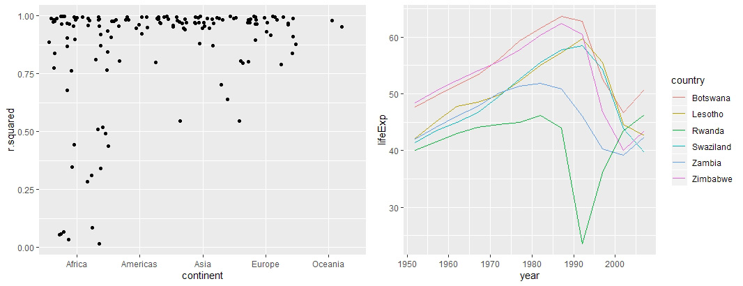
# 使用 glance 函数度量模型效果
==========================================================================
> broom::glance(mod)
# A tibble: 1 x 11
r.squared adj.r.squared sigma statistic p.value df logLik AIC BIC
<dbl> <dbl> <dbl> <dbl> <dbl> <int> <dbl> <dbl> <dbl>
1 0.954 0.949 0.804 205. 5.41e-8 2 -13.3 32.6 34.1
# ... with 2 more variables: deviance <dbl>, df.residual <int>
==========================================================================
# 计算所有模型的统计参数
glances <- group %>% mutate(glances=map(models, broom::glance)) %>%
unnest(glances, .drop=T) # 舍弃除 glances 的其他列表
# 通过对R—squared 进行排序找到拟合不够好的国家模型
glances %>% arrange(r.squared)
# 将所有国家的模型拟合度可视化
# 由于观测值相对小,小于1,而且是一个离散变量,因此使用jitter
glances %>% ggplot(aes(continent, r.squared)) + geom_jitter(width = 0.5)
# 取拟合度差的子集
bad_fit <- filter(glances, r.squared<0.25)
gapminder %>% semi_join(bad_fit, by="country") %>%
ggplot(aes(year, lifeExp, color=country)) + geom_line()
# 1992-卢旺达-艾滋病爆发
关于 nested data.frame 的细节补充
1
2
3
4
5
6
7
8
9
10
11
12
13
14
15
16
17
18
19
20
21
22
# 默认情况下,传入的列表,会被拆成向量分别放到每一列
data.frame(x=list(1:3,2:4))

# 创建 nested data.frame

# 使用 tidyr::nest()
gapminder %>% group_by(country, continent) %>% nest()
gapminder %>% nest(year:gdpPercap)  # nesting year ~ gdpPercp

# 通过向量化函数--mutate()
df <- tribble(~x1, "a,b,c", "d,e,f,g")
df <- df %>% mutate(x2=stringr::str_split(x1, ","))
df %>% unnest()

# 通过 tribble 函数和 map
sim <- tribble(
    ~fun,       ~params,
    "runif",    list(min=-1,max=1),
    "rnorm",    list(sd=5),
    "rpois",    list(lambda=10)
)
sim %>% mutate(sims=invoke_map(fun, params, n=10))
CHPT21 - R Markdown
简介
R Markdown provides a unified authoring framework for data science, combining your code, its results, and your prose commentary. R Markdown documents are fully reproducible and support dozens of output formats, like PDFs, Word files, slideshows, and more. R Markdown files are designed to be used in three ways:
- For communicating to decision makers, who want to focus on the conclusions, not the code behind the analysis.
- For collaborating with other data scientists (including future you!), who are interested in both your conclusions, and how you reached them (i.e., the code).
- As an environment in which to do data science, as a modern day lab notebook where you can capture not only what you did, but also what you were thinking.
_.Rmd 文件由以下三部分组成
- An (optional) YAML header surrounded by
--- - Chunks of R code surrounded by
` ` ` - Text mixed with simple text formatting like
#heading and_italics_
R Markdown 的渲染步骤
When knit the document,Rmarkdown 把文件 send 到 knitr,knitr 生成一个新的 markdown 文件(.md),然后通过 pandoc 进行 processing,最后生成输出的文件。
示例一:Text formatting with Mardown
——– Text_format.Rmd ———
1
2
3
4
5
6
7
8
9
10
11
12
13
14
15
16
17
18
19
20
21
22
23
24
25
26
27
28
29
30
31
32
33
34
35
36
37
38
39
40
41
42
43
44
45
46
47
48
49
50
51
52
53
54
55
---
title: "Text Format"
author: "Paradise"
date: "2020年11月22日"
output: html_document
---
Text formatting
------------------------------------------------
斜体格式
*italic* or _italic_
加粗格式
**bold** or __bold__
背景灰色填充格式
`code`
上标与下标
superscript^2^ and superscript~2~
Headings
------------------------------------------------
# 1st Level Header
## 2nd Level Header
### 3rd Level Header
Lists
------------------------------------------------
* Bulleted list item 1
* Item 2
* Item 2a
* Item 2b
1. Numbered list item 1
1. Item 2. The numbers are incremented automatically in the output.
Links and images
-----------------------------------------------
<http://example.com>
添加相关的linked phrase
[linked phrase](http://example.com)
中括号内为可选标题文字

Tables
----------------------------------------------
First Header | Second Header
------------ | -------------
Content Cell | Content Cell
Content Cell | Content Cell
将上面的 R Markdown 文件渲染成 HTML 文件:
1
rmarkdown::render('./Rmd/Text_format.Rmd', output_flie='Text_format.html')
渲染结果
示例二:Code Chuck
——– Code_chunk.Rmd ———
1
2
3
4
5
6
7
8
9
10
11
12
13
14
15
16
17
18
19
20
21
22
23
24
25
26
27
28
29
30
31
32
33
34
35
36
37
38
39
40
41
42
43
44
45
46
47
48
49
50
51
52
53
54
55
56
57
58
59
60
61
62
63
64
65
66
67
68
69
70
71
72
73
74
75
76
77
78
79
80
81
82
83
84
85
---
title: "Code_chunk"
author: "Paradise"
date: "2020年11月22日"
output: html_document
---
Options of Code Chunks
------------------------------
**knitr**提供了近60个参数选项用于自定义chunk的输出
通过以下网址可以查看全部的options:<http://yihui.name/knitr/options/>.
这里展示比较常用的重要的options
```{r by-name,echo=TRUE,error=TRUE}
x<-runif(10)
y<-runif(10)
x
plot(x,y,type="l")
```
`说明`
---------------------------------
* 使用eval=FALSE,(当代码块有error仍能)输出代码,但是输出文件不包含执行结果
* 使用include=FALSE,运行代码,但是不在输出文件里显示代码或输出结果
* 使用echo=FALSE,输出执行结果,但是不包含源代码
* 使用message=FALSE或者warning=FALSE,输出文件中不包含warning信息
* 使用result='hide'隐藏打印输出的内容,使用fig.show='hide'隐藏图形输出
* 使用error=TRUE,即使有代码块报错也继续输出文件,在调试阶段使用
Table
-----------------------------
默认情况下数据框输出跟在console的输出格式一样,使用kable函数可以输出表格格式
```{r name2}
mtcars[1:5,1:10]
knitr::kable(mtcars[1:5,1:10],
caption = "A knitr table")
```
`说明`
---------------------------------
* 执行**?knitr::kable**了解很多更细致的自定义表格输出的方法
* 更深入的格式显示方法,可以使用**xtable**,**stargazer**,**pander**,**tables**以及**ascii**等包
Caching
---------------------------------
为了实现可再现性,所有的输出内容都是从空白页面开始构建,以确保代码里包含所有重要信息。但是当代码块里面有计算量较大的指令,那就需要用到缓存:定义cache=TRUE。设置缓存时,计算结果会保存到特定文件,下一次执行时,如果代码块没有改变,则引用该缓存文件。
```{r raw-data,eval=FALSE}
rawdata<-readr::read_csv("a_very_large_file.csv")
```
注意例子只是样本代码,设置了eval=FAlSE,不执行
```{r proccessed-data,cache=TRUE,dependson="raw_data",eval=FALSE}
processing the terribly large data
```
此处注意,如果没有定义dependson="raw_data",那么即使读取的csv文件改变了,只要‘processing’没有改变,仍然不会重新执行该代码块,而是直接使用缓存。
如果担心"a_very_large_file.csv"文件内容本身发生改变,导致后续的代码使用缓存而出错,可以在raw_data代码块增加cache.extra=file.info("file_name")这样可以检查文件的相关信息,包括最后一次修改的时间。
```{r clean_up,eval=FALSE}
knitr::clean_cache()
```
使用上述指令可以清除所有的缓存(当缓存的文件越来越复杂混乱的时候)
Global Options
----------------------------
`关于全局设置的内容在第五部分的script中出现`
Inline Code
-----------------------------
直接在文本中间引用并嵌入R代码,knit之后以执行结果的形式显示
For example,we have data about **`r nrow(diamonds)`** diamonds.
在文本中嵌入数字的时候,最好设置精确度,以及在大数中插入逗号(使用**format**函数)
```{r,collapse=FALSE}
a<-1234567
format(a,big.mark = ",")
b<-0.1234567
format(b,digits = 2)
```
渲染结果