CHPT22 - Graphics for Communication with ggplot2
此前介绍的绘图操作仅限于 EDA 过程中的可视化,本章介绍用于 Report 的可视化技巧,即图片的修饰和美化。
标题与副标题、图片脚注、坐标轴与图例标题,数学公式
1
2
3
4
5
6
7
8
9
10
11
12
13
14
15
16
17
18
19
20
21
22
23
24
library(tidyverse)
base <- ggplot(mpg, aes(displ, hwy)) +
geom_point(aes(color=class)) + geom_smooth(se=FALSE)
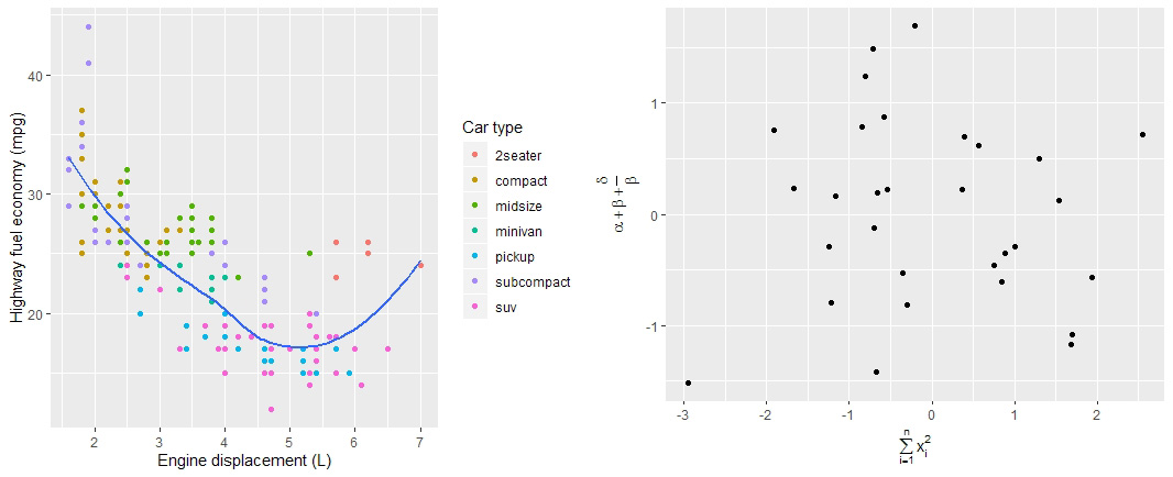
# 使用 labs 函数在图中添加标题和图片标签
base + labs(
title="Fuel efficiency generally decreases with engine size",
subtitle="Two seaters(sport cars) are an exception because of light weight",
caption="Data from fueleconomy.gov"
)
# 使用 labs 函数自定义 axis 和 legend 标题
base + labs(
x="Engine displacement (L)",
y="Highway fuel economy (mpg)",
color="Car type"
)
# 使用 quote 函数输出数学公式格式
df = data.frame(x=rnorm(30), y=rnorm(30))
df %>% ggplot(aes(x, y)) + geom_point() + labs(
x = quote(sum(x[i]^2, i==1, n)),
y = quote(alpha + beta + frac(delta, beta))
)
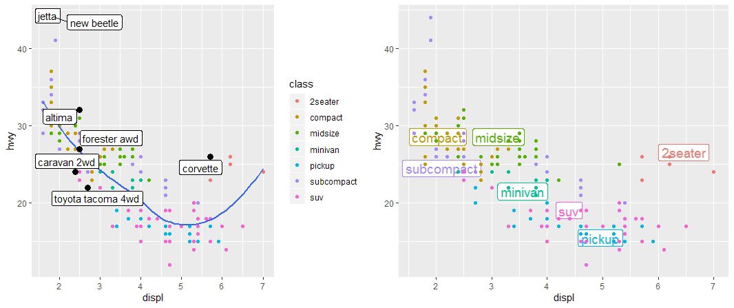
点注释
1
2
3
4
5
6
7
8
9
10
11
12
13
14
15
16
17
18
19
20
21
22
23
24
# 使用 geom_text 函数添加点注释
bestcar <- mpg %>% group_by(class) %>% filter(row_number(desc(hwy)) == 1)
base + geom_text(aes(label=model), data=bestcar)

# 使用 geom_label 函数添加点注释(注释带有边框)
base + geom_label(
    aes(label=model), data=bestcar, alpha=0.5,
    nudge_y=2	# 用于移动注释和点的相对位置
)

# 上述两者皆有注释重叠情况,可使用 geom_label_repel 函数优化
base + geom_point(size=3, alpha=1, data=bestcar) +
    ggrepel::geom_label_repel(aes(label=model), data=bestcar)

# 使用 label 代替图中的 legend
class_avg <- mpg %>% group_by(class) %>%
    summarise(displ=median(displ), hwy=median(hwy))
ggplot(mpg, aes(displ, hwy, color=class)) +
    ggrepel::geom_label_repel(
        aes(label=class), data=class_avg,
        size=5, label.size=0, segment.color = NA
    ) +
    geom_point() +
    theme(legend.position="none")
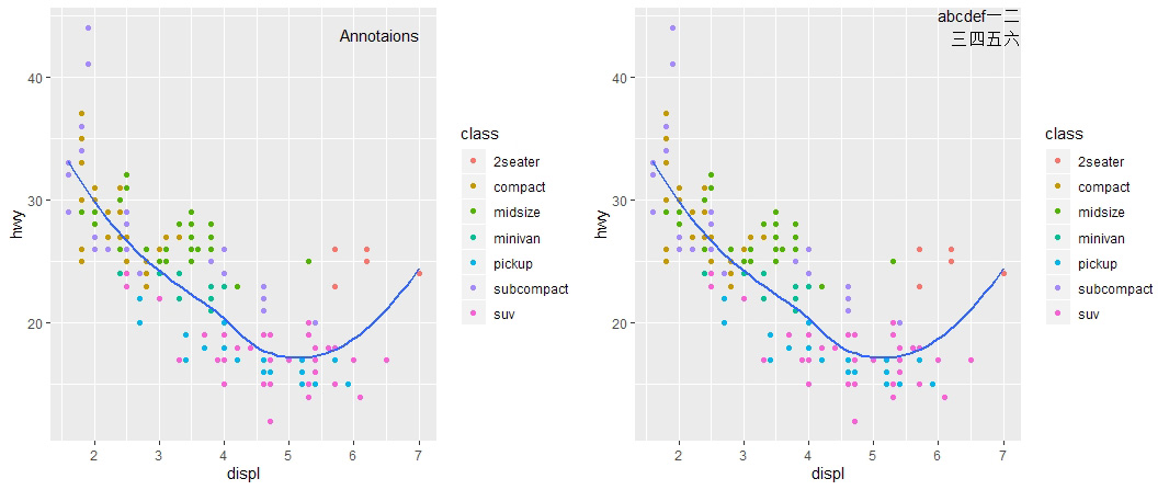
单个注释
1
2
3
4
5
6
7
8
9
10
11
12
13
14
15
16
17
# 使用 geom_text 函数添加单个注释
anno1 <- mpg %>% summarise(displ=max(displ), hwy=max(hwy), label='Annotaions')
base + geom_text(
    aes(label=label), data=anno1, vjust='top', hjust='right'
)
# 使用 str_wrap 函数对注释文本进行排版
anno2 <- tibble(displ=Inf, hwy=Inf,
                label='abcdef一二三四五六' %>% stringr::str_wrap(width=10)
                )
base + geom_text(
    aes(label=label), data=anno2, vjust='top', hjust='right'
)

# 其他常用添加注释(非文本)的函数
geom_hline; geom_vline      # 辅助线
geom_rect                   # 矩形框
geom_segement               # 利用 arrow 参数可以添加 箭头
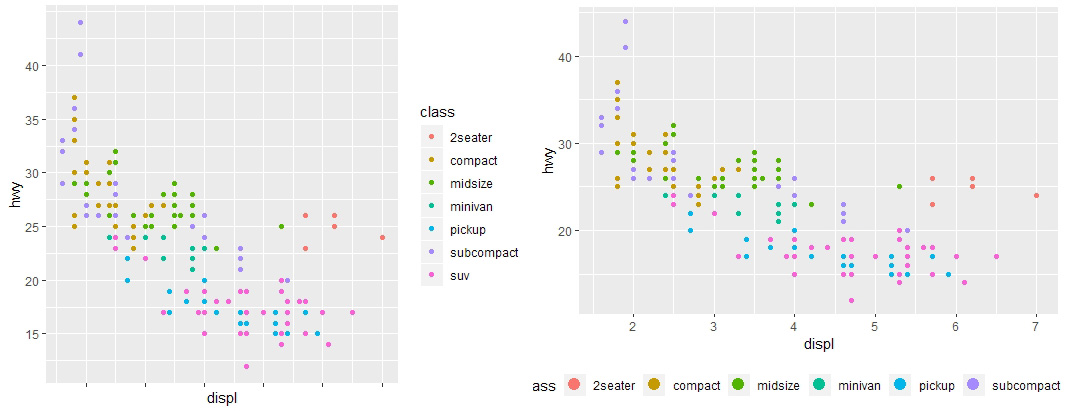
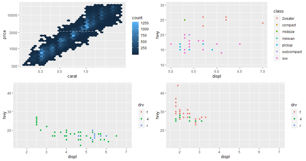
坐标刻度、图例样式
1
2
3
4
5
6
7
8
9
10
11
12
13
14
15
16
# Scales
base <- ggplot(mpg, aes(displ, hwy)) + geom_point(aes(color=class))
# R 会自动调整 scales,当运行 base,相当于:
base + scale_x_continuous() + scale_y_continuous() + scale_color_discrete()

# 调整y轴示数的 breaks,隐藏x轴示数
base +
    scale_y_continuous(breaks=seq(15, 40, by=5)) +
    scale_x_continuous(labels = NULL)

# 使用 theme 和 guides 调整 legend 的样式
base +
    theme(legend.position="bottom") +
    guides(
        color=guide_legend(nrow=1, override.aes=list(size=4))
    )
坐标转换、坐标缩放
1
2
3
4
5
6
7
8
9
10
11
12
13
14
15
16
17
18
19
20
21
22
# 坐标的对数化
# 变量直接对数化,坐标刻度也跟随改变
ggplot(diamonds, aes(log(carat), log(price))) + geom_hex()
# 转换坐标轴,坐标刻度不变
ggplot(diamonds, aes(carat, price)) + geom_hex() +
    scale_x_log10() + scale_y_log10()

# 设置坐标轴取值范围
base + coord_cartesian(xlim = c(5,7), ylim = c(10,30))

# 不同图片使用相同的scale方便进行比较
suv <- mpg %>% filter(class=="suv")
compact <- mpg %>% filter(class=="compact")
# 借助 limits 参数以及 range、unique 函数创建统一坐标尺度
x_scale <- scale_x_continuous(limits=range(mpg$displ))
y_scale <- scale_y_continuous(limits=range(mpg$hwy))
color_scale <- scale_color_discrete(limits=unique(mpg$drv))
# 使用统一的坐标尺度
ggplot(suv, aes(displ, hwy, color=drv)) + geom_point() +
    x_scale + y_scale + color_scale
ggplot(compact, aes(displ, hwy, color=drv)) + geom_point() +
    x_scale + y_scale + color_scale
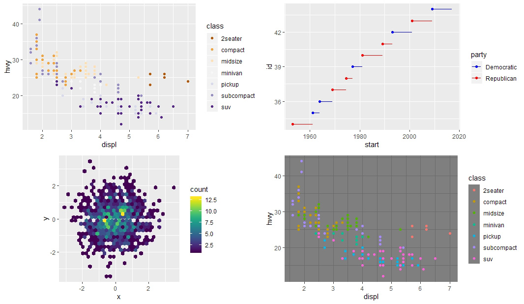
颜色风格
1
2
3
4
5
6
7
8
9
10
11
12
13
14
15
16
17
18
19
20
21
22
23
24
25
26
27
28
# 颜色风格的设置(scale_color_brewer)
base <- ggplot(mpg, aes(displ, hwy, color=class)) + geom_point()
all_scales <- list(
    style1=c("YlOrRd","YlOrBr","YlGnBu","YlGn","Reds","RdPu",
             "Purples","PuRd","PuBuGn","PuBu","OrRd","Oranges",
             "Greys","Greens","GnBu","BuPu","BuGn","Blues"),
    style2=c("Set1","Set2","Set3",
             "Pastel2","Pastel1","Paired","Dark2","Accent"),
    style3=c("Spectral","RdYlGn","RdYlBu",
             "RdGy","RdBu","PuOr","PrGn","PiYG","BrBG")
)
base + scale_color_brewer(palette=all_scales[[3]][6])

# 手动设置颜色风格(scale_color_manual)
presidential %>% mutate(id=33+row_number()) %>%
    ggplot(aes(start, id, color=party)) + geom_point() +
    geom_segment(aes(xend=end, yend=id)) +
    scale_color_manual(
        values = c(Republican="red", Democratic="blue")
    )

# 使用 viridis 包优化颜色风格(scale_fill_viridis)
df <- tibble(x=rnorm(1000), y=rnorm(1000))
# ggplot(df, aes(x,y)) + geom_hex() + coord_fixed()
ggplot(df,aes(x,y)) + geom_hex() + viridis::scale_fill_viridis() + coord_fixed()

# 使用 ggplot2 的内置主题
base+theme_dark(base_line_size=0)
CHPT23 - R Markdown Formats
1
2
3
4
5
6
7
8
9
10
11
12
13
14
15
16
17
18
19
20
21
22
23
24
25
26
27
28
29
30
31
32
33
34
35
36
37
38
39
40
41
42
43
44
45
46
47
48
49
50
51
52
# (1) Introduction
# 在 render 函数中设置输出文件格式
rmarkdown::render("example.Rmd", output_format = "word_document")
# 或者在 RStudio knit 按钮的下拉菜单中选择 knit 的格式

# (2) Output Options
# 查看输出html文件时可以设置哪些参数(Then cmd:Ctrl+3)
?rmarkdown::html_document()
# 使用 expanded output field 改写 default 的参数(Rmd 文档)
output:
    html_document:
        toc: true
        toc_float: true
# 输出多个不同格式的文件
output:
    html_document:
        toc: true
        toc_float: true
    pdf_document: default

# (3) Documents
# 支持的文件格式:
# pdf、word、odt(OpenDocument Text)、rtf(Rich Text Format)、md、github
# 使 code chunk 隐藏的方法:
knitr::opts_chunk$set(echo = FALSE)
# 在html文件中,可以通过option设置(点击可以使代码出现)
output:
    html_document:
        code_folding: hide

# (4) Notebooks
# html_document 主要用于与决策者交流
# 而 html_notebook 用于与其他 analysist 交流

# (5) Presentations(类似 PPT 的功能)
# RMarkdown 支持的三种展示格式:
ioslides_presentation()
slidy_presentation()
beamer_presentation()
# 另外两种由 package 提供的格式( revealjs 与 rmdshower 包)

# (6) Dashboards(仪表盘)
# 用于可视化地和快速地交流大量的信息
# 通过 headers 控制输出的布局:
#Each level 1 header(#) begins a new page in the dashboard
#Each level 2 header(##) begins a new column
#Each level 3 header(###) begins a new row

# 具体案例:
render("R4DS5_dashboard.Rmd", output_file = "dashboard.html")
# learn more about flexdashboard:
# see <http://rmarkdown.rstudio.com/flexdashboard/>
渲染结果
1
2
3
4
5
6
7
8
9
10
11
12
13
14
15
16
17
18
19
20
21
22
23
24
25
26
27
28
29
30
31
32
33
34
35
36
37
38
39
40
# (7) Interactivity(交互)
# 任何 html format(document/notebook/presentation/dashboard)都可以包含交互性内容

# htmlwidgets (使用 leaflet 包产生交互性网页)
library(leaflet)
leaflet()%>%
    setView(110.922,21.603,zoom = 2)%>%
    addTiles()%>%
    addMarkers(110.922,21.603,popup = "HOME")
# 其他提供 htmlwidgets 的包:dygraphs/DT/rthreejs/DiagrammeR
# learn more about htmlwidgets: <http://www.htmlwidgets.org/>

# shiny
# htmlwidgets 提供客户端的互动,与 R 完全脱离,内部使用 HTML 和 JavaScript 进行控制
# 而 Shiny 允许使用 R 代码生成互动页面
# 在 Rmd 的 header 中 call shiny
title: "shiny"
output: html_document
runtime: shiny
# 用 Input 函数添加互动性内容
library(shiny)
textInput("name", "What is your name?")
numericInput("age", "How old are you?",NA,min=0,max=150)
# 具体效果见 html 文件:
render("R4DS5_shiny.Rmd",output_file = "shiny.html")
# learn more about shiny<http://shiny.rstudio.com/>

# (8) Websites
# learning more: <http://bit.ly/RMarkdownWebsites>

# (9) Other Formats
# The bookdown package makes it easy to write books.
# Read <Authoring Book with R Markdown>
# see <http://www.bookdown.org>

# The prettydoc package provides lightweight document formats with attractive themes

# The rticles package
# see more: <http://rmarkdown.rstudio.com/formats.html>
# create your own formats: <http://bit.ly/CreateNewFormats>
渲染结果
CHPT24 - R Markdown Workflow
SKIP
END